
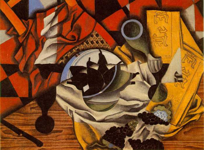
Juan Gris
Juan Gris was a Spanish artist, who refined cubist vocabulary into his own unique and instantly recognised visual language. Still life was the most popular cubist theme as it allowed artists to use everyday objects, whose forms are still recognizable after they have been simplified and stylised.
Gris was more calculating than other cubist painters in the way he composed his pictures, where every element of a painting was considered with precision: line, shape, tone, colour and pattern.
Cubism is created when looking at an object in a different perspective, not from a fixed viewpoint. Gris' work is a good and interesting way to show this effect. I like his use of colours and images and how he rearranges space so the subjects become interchangeable elements.
I have experimented with Gris' style in my own work and would like to experiment further into it in future projects.
This morning we went around the college and drew a double page spread of architecture in three main areas; the arches in South Block, the glass stairwell at the college entrance, and crowds in the Refectory. I managed to do studies at the aches and the entrance. we could also draw parts of the building work, but I did not get round to drawing any of these, so I would like to try and draw studies of these in my own time.
This afternoon, we took our studies and photocopied our favorite pieces five times, so we could work into them. we used techniques like ink wash, highlight oil pastel and reductive drawing. My favorite technique was the highlight oil pastel technique because the tone is easy to differ, and it works well as a effect. I did like the ink wash also, but doing the tone was more difficult, especially the lighter tones, as the paper was wet, making it darker and blend into the darker tones.
I do not like how the reductive drawing turned out compared to the other two techniques, because it's hard to do tone and shadow with it, and it's difficult to add detail.
I wish I had drawn more studies, so I had more to choose from, and I really wish I had drawn some figure images instead of sticking with just building structures. Again, I may try and do some figure drawings in my own time.
David Hockney - Cubism
Hockney's work has strong links with Cubism, producing them to introduce three artistic elements, which a single photograph can not achieve; layered time, space and narrative.
The photos are taken taken from different perspectives at slightly different times, resulting an affinity with Cubism when put together in one montage.
I really like this style and effect by Hockney, and find his work very inspiring. He takes a very different approach for other artists, which makes his work unique and interesting.
What I could take away to use in my own work, would be to use perspective angles, and the build up of layers to create one image.


Evaluation - 24.4.12
This morning we did 10 mono prints, using the drawings we did last week. We photocopied the images we wanted to use. Then, with the finished prints, we rearranged them onto A2 paper, by over-lapping and cutting out, to construct a imaginary scene. We are to work into them further using different medias, such as; graphite, charcoal, tissue paper, newspaper and photocopies.
We began to work into the pieces this afternoon. At first, I struggled to get started because I was not sure how to begin constructing the scene with different medias, including the mono prints. However, after some suggestions, I got a few ideas. My piece is not yet finished, but so far, there are some aspects that I do like, for example, the medias on the arches. I would like to work on the medias some more, but so far they look good.
Everyone gathered all their work they had been doing, and we all reviewed each others work. After looking how other people have gone about their own pieces, I have gotten a fair idea what more I can do with my own.
To improve, I would like to build up on the left side of my piece, as it is quite bare with empty space. Also on the images, I will ass colour wash on the foreground images, to make them stand out on the background images.

Lyonel Feininger
Lyonel Feininger was a German-American artist, who become one of the best known, and most admired contributors to Cubism. Many of Feininger's paintings show his distinct style:
angular plans of light intersecting and overlapping one another, often in muted 'industrial' shades.
His earliest works have a lively, Art Nouveau look, which later shifts to a muted, impersonal style.


Evaluation - 1.5.12
This morning we took photography or images from the internet, of buildings (in my case I use images of the Crooked Spire, which I had taken over the weekend) in different viewpoints. This is to give our work a Cubist aspect, like in the style of Lyonel Feininger. We enlarged the photographs to A3 size and drew them onto A2 card to construct an imaginary landscape. We did two different landscapes.
This afternoon we worked onto our drawings using mixed medias, such as collage to make make block areas, emulsion, different tools for mark making and colour washes or coloured pastels - earthy colours.
Next week we are going to continue building up on these by using the relief print technique using masking tape.
Purpose of Concept Art
Concept art is a form of illustration that is used extensively in media production and is one of the first stages of creating a game, animation or comic book.
Concept art is a way to convey an idea before it is added to a project. These are often created digitally through such programs as Photoshop, or through traditional methods, such as acrylic or oil paints, pencil drawings or charcoal sketches.
Once this stage is done, the art is then digitised to 3D using such programs as Maya, to bring realism to it.
The most common types of concept art are usually science fiction or fantasy, but due to the nature of video games, it is now possible to find concept art on almost any theme. The designers need to show visualisations of ideas, for example; weapons, characters, landscapes and vehicles.
There are arguments about weather concept art can be classed as 'art', as they are a build up of illustrations and ideas. But now that game art is becoming more advanced and realistic, the question still stands for debate.
Evaluation - 15.5.12
This morning, I carried on with my two A2 imaginary landscapes, which I constructed with images of the Cooked Spire, using mixed media.
I used brown paper to collage and block areas and worked around and into the piece using other medias such as; ink, emulsion, tissue paper, chalk pastel etc. I tried making both slightly different from one another.
Later this afternoon, I did five masking tape relief prints. I don't really like this technique and found that it doesn't always turn out right the first time.
Print 1 and 2 are of a random brick design I did. 1 did not turn out as clear as 2, but this could be due to the amount of ink used or the pressure put onto them. I'm pleased with 2, but I could have used a different colour of ink for both of these, as they are too dark.
Experiments 3-5 are selected shapes taken from my image of the Crooked Spire. Image 5 is probably the best out of these three because the shapes are the most recognisable.
Evaluation - 22.5.12
This morning, I took photographs of objects around the classroom (only the doll and the monkey) and then drew the object. Once we had drawn the object, we then made it into our own character (I did the light bulb image at home in my own time).
This afternoon, we drew an A2 enlarged drawing on the chosen image we wanted to use - for me, I chose the doll - and used the one-point perspective method, so the image was as accurate as it could be. I found that the one-point perspective method did not work well for my image, and so ended up using the box method, as my image is made up of curves and a lot of rounded shapes and edges.
We photocopied our drawings, so we had three copies, the worked into them using mixed media and mark making.
We are finishing these off next week.
Game Environments
Assassin's Creed:
 The environmental art style in this game is all about realism. The game is very historically accurate, and has educational worth. The level of detail is a big attraction when playing, and allows the player to become more immersed in the story. The settings play a huge part in this game in particular because it is about adventuring around cities, climbing buildings, running over rooftops, and investigating hidden secrets and locations. Players are actively engaging with the environment and proactively learning about the architecture and landscapes of a historic environment.

Final Fantasy XIII:
 Final Fantasy is known for its exceptionally vivid environments. The artists and designers present remarkable freedom to imagine expansive worlds that enhance the players experience, and envelops the audience in an immersive universe.
There is a wide variety in this game and the players experience can go from being in futuristic cities, to endless green fields or vast deserts. The graphics in this game are absolutely gorgeous and the amount of detail put into every aspect is amazing.


Heavenly Sword:

Heavenly Sword really pushes the envelop with some fantastic environments, from snowy hills, riverbeds, barren deserts, a shrine nestled in the mountains and a castle city amongst waterfalls.
This game really does allow the player to dive into this ninja fantasy.


Final Evaluation:
Looking back over the assessment and grading criteria, I believe I have covered the pass grades and some of the merit grades.
P1, is to describe the purpose of concept artfor games, which I have done, but I think it may be too brief to get a merit. To achieve a merit, I should maybe gather examples of concept art and review and compare them to other work.
P2, is about applying different drawing media and techniques to produce alternative representations. I have done this and I think I could have boarded onto a M2.
P3, is having drawn anatomy, environment and object concept artwork showing basic standard of drawing skills. I have covered this, along with covering P4.
Throughout this project, I understand the purpose of concept art and have researched designers and artists to help me with my own developments. I have looked at both primary and secondary sources to also help me.
(I have experimented with all kinds of media and techniques to produce my outcomes and expanded my knowledge of using these in my developments and for future projects.
I'm most happy with my object character drawings. This has allowed me, to an extent, to have freedom with my imagination to come up with something unique and individual. I would really like to experiment with more interesting objects if I had more time.
I have tried to include technical terminology when annotating, which I believe I have done quite successfully.
The research I have done is appropriate for this project and has proved useful to my development work and has influenced my style in some ways.
I have experimented with a variety of materials and techniques, some of which I have never used/done before, such as; using emulsion and masking tape relief prints.
If I was given more time, I could improve my work by working into my pieces more for a more detailed and interesting approach. I would also like to experiment further with certain techniques and areas of the brief, like the object character drawing, as we only had a week, maybe two, on this section.
I have worked very independently in this project, both at college and at home in my own time. I have spent many hours at home catching up with work I've missed and finishing certain things off from college. I prefer to do annotating in my own time at home too.
Again, I could improve my time management, as I take too long on some aspects of work. I am too precious with my work, and this makes me lack when experimenting. I will try to stop doing this for future projects.
No comments:
Post a Comment