At the moment I am currently not interested in going to university, but from going on this trip, if I was ever interested in going, the places that appealed the most to me were Nottingham Trent and Plymouth doing either the games design course or photography course (at Plymouth they had more areas of photography to choose from).
In our group discussion, we all agreed that on some stands, people were not approachable and did not want to talk or give enough information.
My overall opinion of this trip is that it is still too early to talk about university because we have only had a couple of months on our current course, and it is unclear in which we want our career path to be. I think it will be more useful next year when we all have a clearer idea.
Wednesday, 30 November 2011
Tuesday, 15 November 2011
Laura Mccafferty, Ralph Steadman and Peter Clark
Laura Mccafferty
 Laura Mccafferty is a Nottingham based artist who blends Textiles and illustration to create snapshots from real life personal experiences, such as; social events and environments with sensitivity and humour. She visually records human interaction with craft base techniques, using textiles, screen print and hand stitch to create her hyper real artwork which she has become best known for.
 Laura’s work has been exhibited nationally and internationally in magazines like Embroidery magazine and Vogue-Australia and press worldwide.
Her work is different and unique in a way, but personally I’m not a huge fan. In my eyes her work is all the same and even though she uses textiles like Peter Clark, her approach is too flat and doesn’t appeal to me as much as Clark’s work. It also seems scruffy and childish.

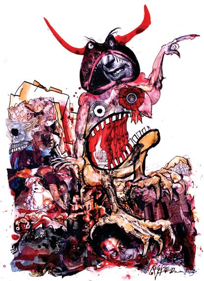
Ralph Steadman has produced thousands of groundbreaking and influential artworks in his 40year career.
Born 1936, Ralph began his career as a cartoonist and through the years has widely expanded into many fields of creativity. He is now recognised as an artist, writer, sculptor, cartoonist and designer, and has illustrated such classics as Alice in Wonderland, Treasure Island and Animal Farm.
I really like the craziness and darkness of Steadman’s work, and the colours he uses to build up his illustrations. l think he is a very inspiring artist with a twisted, yet vivid imagination and I would really like to incorporate his style in my own illustrations.


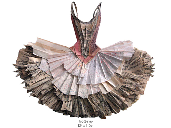
Peter Clark is a British artist who graduated from Manchester College of Art and Design and began his career as an illustrator and designer of animation for television.
In his work, he uses found papers, old stamps, maps, labels, love letters, cards, buttons, dress patterns and textiles to build up his collages. Using different techniques, he manipulates paper, to create three-dimensional images, working the textures, patterns and colours of his chosen materials.
Monday, 14 November 2011
Doodle

This is my doodle strip. I am pleased with most of the outcome, but there are certain aspects that I am not happy with and could do with improving. In my opinion there are still a lot of blank spaces that need filling.
Monday, 17 October 2011
Zhou Fan

Zhou Fan has always had a strong fascination with jellyfish and a lot of his work is based around these dreams he had when he was a young boy, many jellyfish floating in the sky, some of which fell to the ground on parachutes and became mushrooms. These dreams had a strong impact on the artist, and he remembers them vividly.

Zhou Fans work is colourful, and very expressive. His work is unique and different with strong imagination. I find it very beautiful and inspirational.

Thursday, 13 October 2011
Jonathan Wong
 Jonathan Wong is 19 years of age. He is an aspiring graphic designer/illustrator born and raised in Limerick, Ireland. He is currently studying Graphic Design in the Limerick School of Art and Design
 Art has always been a big passion of his, ever since he was young. His primary goal in life is to make a living out of doing something he loves, and that is with art.
What Inspires Jonathan Wong:
“My inspiration comes from a lot of things. I love watching movies and I find the work of people like Stanley Kubrick very inspiring.”
 His dedication to his craft and the way he is a complete perfectionist are things everyone aspires to. Music is also very important and he find it helps him substantially when he is working.
He got started in the field of graphic design by his fascination with the world around him. He’s always been creative ever since he was young.Because he is still of a young age, he hasn’t yet got a set style technique. He loves to experiment and loves to work differently from project to project.
Masha Gubar (Limkis)

Here are a few words from the artist:
 “My art, my work is everything to me.
I like to think through the eyes of art, to plunge into color combinations.
I believe if a person isn’t developing, he’s slipping. It’s not enough just to keep at a high level, one needs to develop constantly, to work hard. That’s why there’s nothing better than a challenging work, which makes you exceed yourself.
Everything is for the better. Everything that happens to a person is for the better. I think the world likes us, but it doesn’t spoil us. It trains a person and polishes his character.
In short: a romantic person with somewhat philosophical views. Optimist.
Actually, that’s all I can say about myself.
I would like to avoid either praising myself, or criticizing.
I do commissions – various design works and illustrations, and I accept commissions though the Internet.”


Aeiko (Pete Harrison)
 Pete Harrison has worked for a variety of clients over a wide range of media; Dolce & Gabbabna, Nike, Microsoft, MTV, Orange, Samsung, Jameriquai, Intel, Walls Magnum, Konami, Sky, Trojan, RBS/Natwest, Sprite, Unicef, Peugeot, BMW, Dell, Sigma, Guiness, Computer Arts, Fall Out Boy, Dahra, Royal Mail, Advanced Photoshop, Vinly Abuse, Marlboro, Harrods and many many more.
  When he was 12, he wanted to be a graphic designer. Knowing this he was able to tailor his education around what he wanted to become. At school he studied art and design, same at A-Level. He went to University and studied MediaLab Arts.
He knew he wanted a career in the creative industries and during University he started creating digital art, and by the time he had finished he had a verity of artworks to show, so he set up a website to showcase them. He began posting on a few community and social sites and networking with other designers and illustrators. He was featured in a few magazines and books and exposure started to grow. He took a fulltime job in London working at an agency, and while he was there he set up a clothing label as a hobby, called Funkrush, and commissioned a bunch of friends to do some designs for him.

Funkrush developed very fast and now showcase’s designs by some of today’s top illustrators and designers as well as being stocked in shops all over the UK and Europe. Alongside this he decided to take up freelance and gained some high end clients in the fields of graphic design, web and interactive media, his online presence was still expanding. He was recognized by Computer Arts magazine as one in ten internationally recognised designers in the year 2006.
He’s been designing around 6 years now, since 2003, and has been freelancing fulltime since 2007, Aeiko was set up in 2006.
Definition of Graphic Vector
 Vector graphics is the creation of digital images through a sequence of commands or mathematical statements that place lines and shapes in a given two-dimensional or three-dimensional space. In vector graphics, the file that results from a graphic artist's work is created and saved as a sequence of vector statements. For example, instead of containing a bit in the file for each bit of a line drawing, a vector graphic file describes a series of points to be connected. One result is a much smaller file.
 At some point, a vector image is converted into a raster graphics image, which maps bits directly to a display space (and is sometimes called a bitmap). The vector image can be converted to a raster image file prior to its display so that it can be ported between systems.
A vector file is sometimes called a geometric file. Most images created with tools such as Adobe Illustrator and CorelDraw are in the form of vector image files. Vector image files are easier to modify than raster image files (which can, however, sometimes be reconverted to vector files for further refinement).
Animation images are also usually created as vector files. For example, Shockwave's Flash product lets you create 2-D and 3-D animations.

Tuesday, 11 October 2011
Illustration Friday - Contraption

Comparing Artists - Jack Kirby, Tyler Stout, Bill Sienkiewicz
Today I am going to compare three artists; Jack Kirby, Tyler Stout, Bill Sienkiewicz. I have chosen to compare these artiats because they are all comic book illustrators (and because I'm a complete comic book geek!!!) and they design cinematic posters.
All these artists have done simular projects, working for different companies and industries, but each has their own style.

 Jack Kirby (August 28, 1917 - February 6, 1994), born Jacob Kutzberg, was an American comic book artist, writer and editor. He entered the comics idustustry in the 1930's. He drew various comic strips under different pen names, ultimately settling on Jack Kirby. He is a bit of a legend in the world of comic book illustrators. He helped create Captain America in 1941, but his main creations were the characters he created with Stan Lee for Marvel comics in the early 1960s: the Hulk, Thor, the Fantastic 4, the Silver Surfer, the X-Men, the Avengers and many more.
 Tyler Stout was born and raised in Washington State. He uses a limited amount of colours to his artwork and this helps you to view the intricate - almost etched – detail. Some of its realistic, some of its cartoonish.

My last artist is Bill Sienkiewicz (born Mat 3, 1958) is an Eisner Award-winning American artist and writer for his comic book work, such as for Marvel Comics' The New Mutants and Elektra: Assassin. He often uses oil painting, collage, mimeograph and other forms uncommon in comic books. Just like his Illustrations, he has a very poster like style of layout.
He has worked for many Hollywood movies and has translated some classic stories into sequential artwork.
This image is taken from http://www.billsienkiewiczart.com/gallery.asp?sc=BSELm&page=1
All these artists have done simular projects, working for different companies and industries, but each has their own style.

 Jack Kirby (August 28, 1917 - February 6, 1994), born Jacob Kutzberg, was an American comic book artist, writer and editor. He entered the comics idustustry in the 1930's. He drew various comic strips under different pen names, ultimately settling on Jack Kirby. He is a bit of a legend in the world of comic book illustrators. He helped create Captain America in 1941, but his main creations were the characters he created with Stan Lee for Marvel comics in the early 1960s: the Hulk, Thor, the Fantastic 4, the Silver Surfer, the X-Men, the Avengers and many more.
In 1987, Kirby, along with Carl Barks and Will Eisner, was one of the three inaugural inductees of the Will Eisner Comic Book Hall of Fame.
This image from http://semantink.com/wordpress/2009/11/22/spotlight-x-men/
In his artwork he uses alot of colour to shade and tone, making his work look very realistic and dramatic.
In his artwork he uses alot of colour to shade and tone, making his work look very realistic and dramatic.
 Tyler Stout was born and raised in Washington State. He uses a limited amount of colours to his artwork and this helps you to view the intricate - almost etched – detail. Some of its realistic, some of its cartoonish.
This is different from the style Jack kirby uses, because he uses bold colours to build up his pictures, whereas Stout designs are etchy.
He has worked on projects such as; Captain America, Kill Bill, Let The Right One In, Iron Man and my favourite, Star Wars.
This image is taken from http://www.heyuguys.co.uk/2011/01/08/more-fantastic-star-wars-poster-prints-by-tyler-stout/

My last artist is Bill Sienkiewicz (born Mat 3, 1958) is an Eisner Award-winning American artist and writer for his comic book work, such as for Marvel Comics' The New Mutants and Elektra: Assassin. He often uses oil painting, collage, mimeograph and other forms uncommon in comic books. Just like his Illustrations, he has a very poster like style of layout.
He has worked for many Hollywood movies and has translated some classic stories into sequential artwork.
This image is taken from http://www.billsienkiewiczart.com/gallery.asp?sc=BSELm&page=1
All these artists has a a simular poster like style layout, but each one has a different way of portraying their outcome. Out of all the illustrators Kirby has the most realistic and professional style. I particually like Sienkiewicz's work because he uses different techniques to most comic artists, making his work more unique and stand out.
Something that I have noticed which is simular, is Jack Kirby and Tyler Stout have done mostly the same chararcters and taken part in the same projects, but for different companies. A story that is the same they have both taken part in is Captain America and all three artists have all done their own concept of Iron Man, but even though they are the same, each artist has his own unique and individual approach towards the subject. For example, the use of colour and tones and shadows, how the images are drawn - thick and thin lines, cartoony, sketched drawings - and also what techniques they have used. Most comic artists, use inks and pens, this is the same for Jack Kirby and Tyler Stout, but Bill Sienkiewicz uses oil painting, collage, stencils etc.
Monday, 10 October 2011

Friday, 7 October 2011
Jonathan Glazer

Today we looked at Jonathan Glazer.
We looked at 5 adverts he has directed, two Guinness called 'Surfer' and 'Swim Black', two Stella called 'Whip Around' and 'Last Orders' and Levis called 'Odyssey'.
We then looked at two music videos, 'Virtual Insanity' by Jamiraqual and 'The Universal' by Blur.

The story behind 'Surfer' is a group of surfers, waiting for the perfect wave. As it arrives, the crashing 'white horses' turn into real horses. In turn, each surfer 'crashes out', leaving only one, who manages to conquer the wave. The others join him on the shore to celebrate. I like this video because its dramatic. I found through watching all of his videos, he focus' around portraying serious videos, using dramatic background music. In this video he extends this effect more by using black and white.
Friday, 30 September 2011
David Shrigley vs. Charles Burns
Today we watched two very different animations. The first animation we watched is called 'Who I Am and What I Want' by David Shrigley.


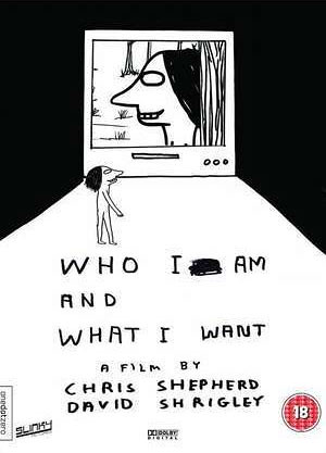
This is the cover of 'Who I Am and What I Want' by David Shrigley
The second animation is called 'If I Had A Heart' by Charles Burns, which is the music video for Fever Ray.
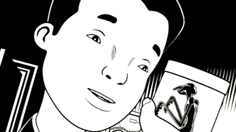
This is a still from the animation 'If I Had A Heart'
The animation 'Who I Am and What I Want' is similar to Charles Burns animation 'If I Had A Heart' because they are both black and white and in 2D.
However, David Shrigley's animation is very different because it is quick hand drawings and sketches, also the video is more quirky and twisted. Although it is amusing it can also be dark and difficult to understand and follow.
The story behind this animation is of a man, called Pete, who bares his emotion, history, hang ups and desires.
This is Shrigley's animation.
Charles Burns animation sticks to the black and white style like David Shrigley's, but looks more realistic because in his drawings he uses more shading and shadows to give it a 3D effect. This story is about peoples fears. It shows unique sequences that shows peoples fears becoming reality.
This is Charles Burns animation.
Overall, they are similar in the sense that they are in black and white, but they portray completely different stories and styles.
http://www.davidshrigley.com/index.html - This is a link to David Shrigley's page
http://lambiek.net/artists/b/burns.htm - These are links to Charles Burns pages and art work
Friday, 23 September 2011
Michel Gondry

Today we watched a DVD, directed by Michel Gondry. We focused on the song by Jean - Francois Coen called La Tour De Pise.
The videos main theme is based around typography. The sort of typography used is taken from signs and magazines/newspapers.
The lyrics of the song are matched, this is a clever and and creative aspect and because the song is of a slow tempo, it works well.
Altogether, it makes a rather boring song interesting.
http://www.michelgondry.com/


Subscribe to:
Posts (Atom)